This is part 3 of a 3-part series about my trip to Portugal in 2022. The first, about Porto, can be found here. The second, about Lisbon, can be found here.
When deciding where to travel for our first international trip since the start of the pandemic, we selected Portugal for many reasons. Beautiful scenery and architecture, great food, interesting culture, reasonable prices, and good COVID safety precautions. However, I’d been dreaming of visiting Portugal even before the pandemic and longed to photograph and wander through picturesque neighborhoods. Starting in late January, I regained an interest in sketching and drawing and tried to figure out which style resonated with me the most. I then discovered urban sketching - drawing what you see around you to capture the essence of the moment - and decided to use Portugal as a test run.
Discovering Watercolor
I took a few classes through Domestika, a website filled with professionally produced short courses that introduce myriad topics, and started feeling out which styles resonated with me the most.
I initally thought that cross-hatching in pen and ink would be a good style for me, given its simplicity, and I started with David Morales’ Illustrated Diary course. While I enjoyed his approach to contours, I grew impatient with the cross-hatching (drawing parallel lines to create darkness on the page) and looked for another strategy.
Next, I took Sorie Kim’s Daily Sketching for Creative Inspiration course which opened my eyes to so many types of media and an approach that didn’t rely heavily on pencil underlays. I played with an ink brush pen, fineliners, and my ultimate favorite, watercolors. This course was integral in my journey of self-discovery. Sorie encouraged a carefree approach and taught drawing from imagination, where you can create creatures or objects from scratch based on a memory bank of references. This helped me understand how artists make things up seemingly from out of thin air and showed me the immense power of the brush - recording the world as I see it without needing to capture it perfectly. If I want to paint more impressionistically or decide that a tree or person in the scene isn’t needed, I can do whatever is needed to capture the essence of a scene.
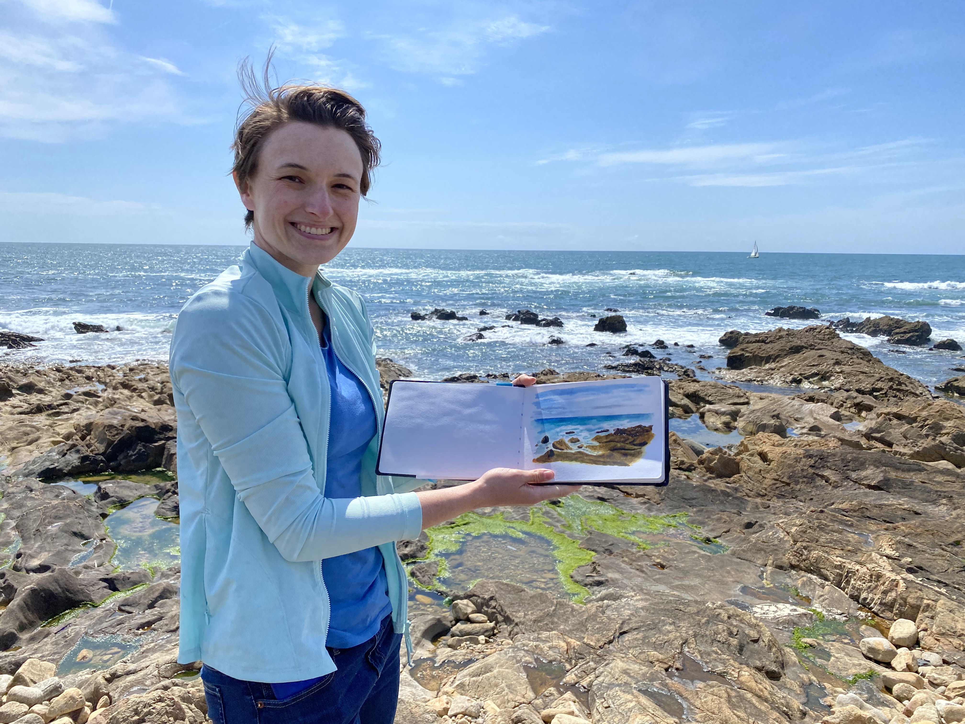
This all circled back around to my love of travel photography as a way of documenting trips. With our new less-rushed style of travel, I knew we’d have a lot of time on our upcoming Portugal trip. I decided that I wanted to learn how to document my travels through ink and wash. I enrolled in Alicia Aradilla’s Watercolor Travel Journal course and was absolutely hooked. I loved the vibrant colors, the variety of sketchbook layouts, and how the trip was documented through these pages. It combined my love of bright colors with my understanding of proportions and hand-eye coordination from my time as a mechanical engineer with a sprinkling of graphic design page elements. My childhood Doctor Who newsletter layout and web design skills were coming back in full force! My final project for that course, a single page travel journal spread featuring my trip to Valley of Fire State Park back in 2019, turned out well enough that I knew I had potential with watercolor.
My final project from Alicia Aradilla’s watercolor travel journal course.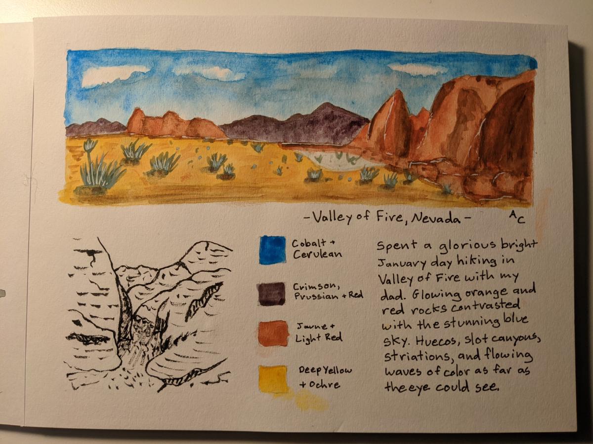
Preparation for Portugal
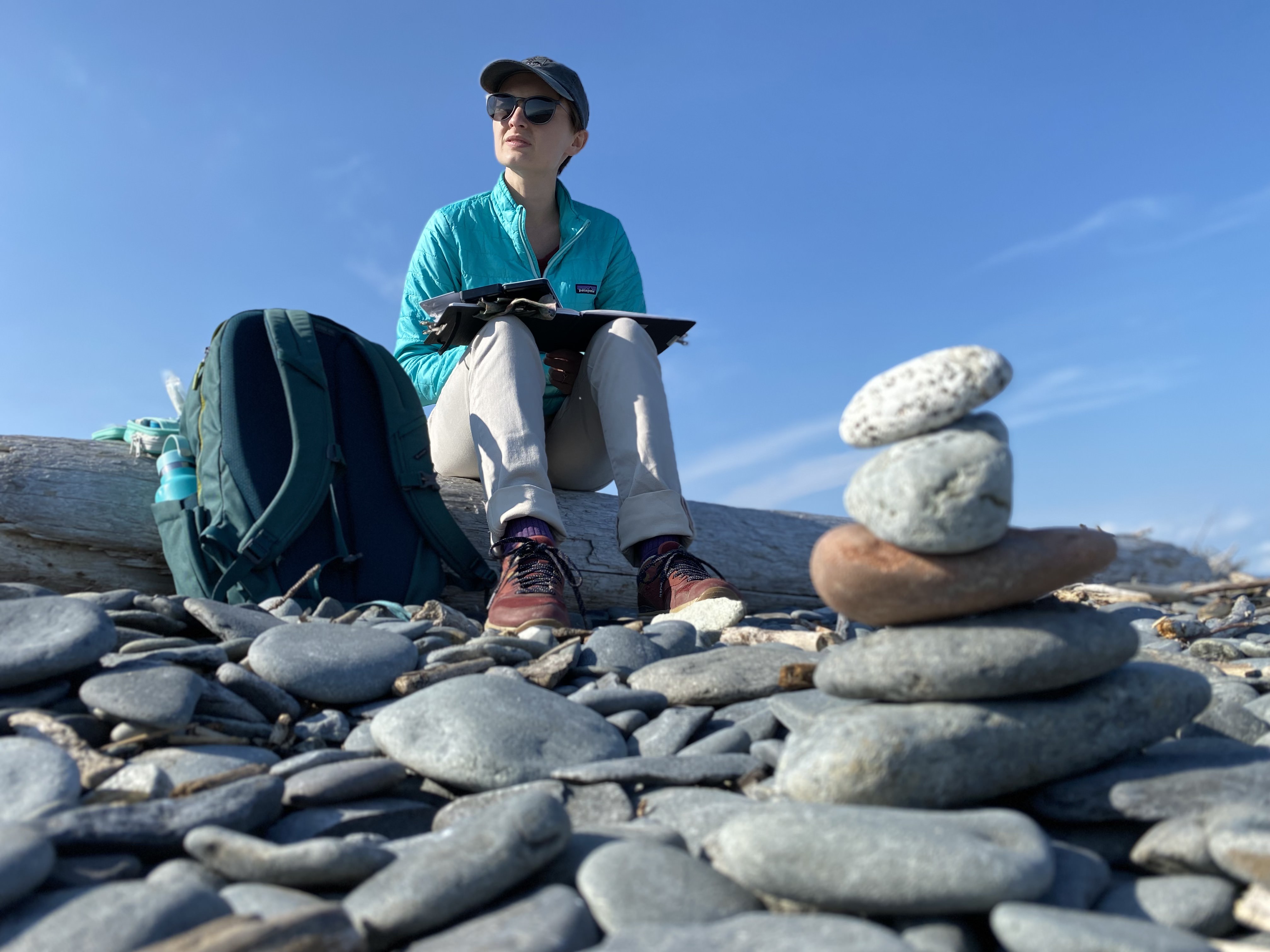
I spent the next few months using Alicia Aradilla’s Patreon posts to teach myself how to paint scenes I expected to see in Portugal - buildings, skylines with red rooftops, landscapes with water, and bread. I updated my travel kit from student-grade to artist-grade paints and built out my color palette to 12 colors after challenging myself to start with the 3 primaries. To test it out prior to Portugal, we took a day trip to Enchanted Rock State Park where I painted and Glenn went on a nice hike.
Painting at Enchanted Rock State Park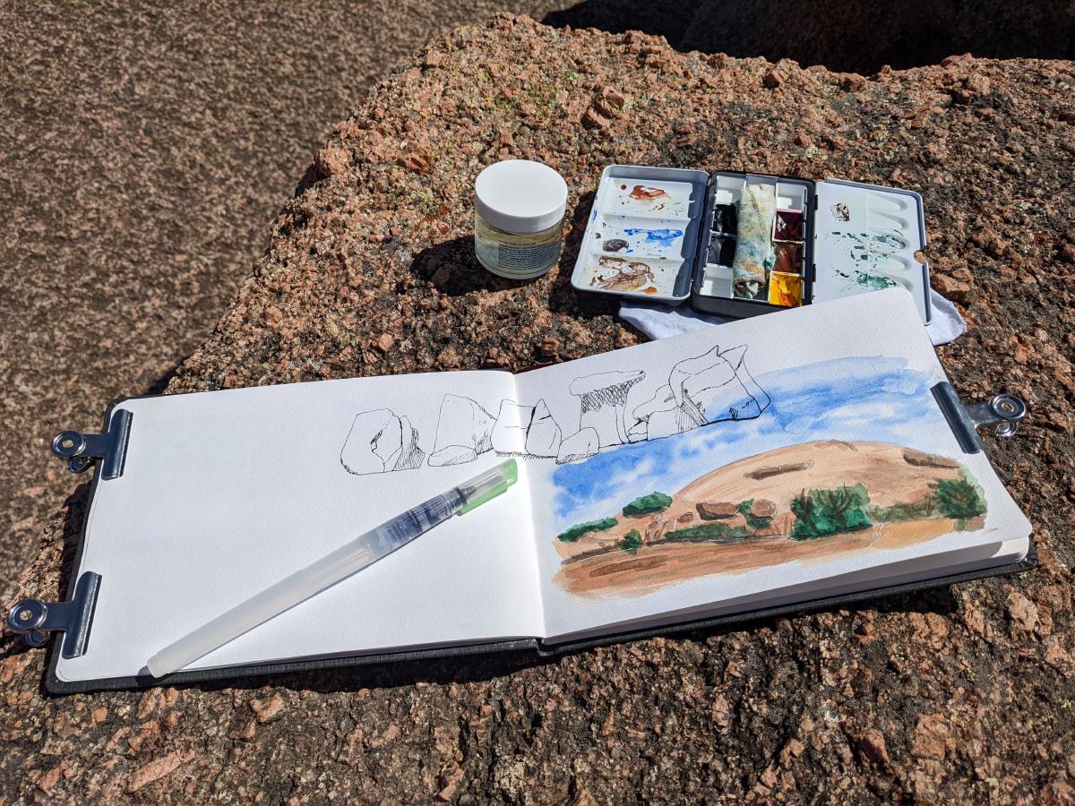
I started out using water brushes (a brush with water in its handle, mitigating the need for a water container) as they are excellent for travel. They don’t create the same effects as natural brushes, but you can’t beat the convenience! For paper, I am using the Hahnemühle watercolor book in an A5 landscape orientation.
Portugal Sketchbook Pages
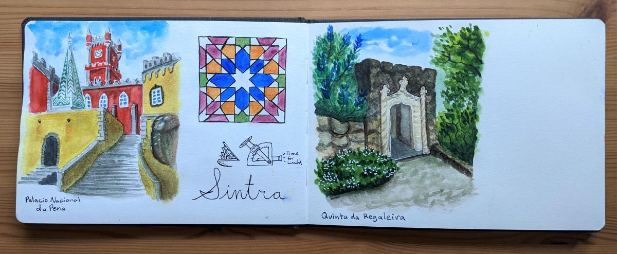
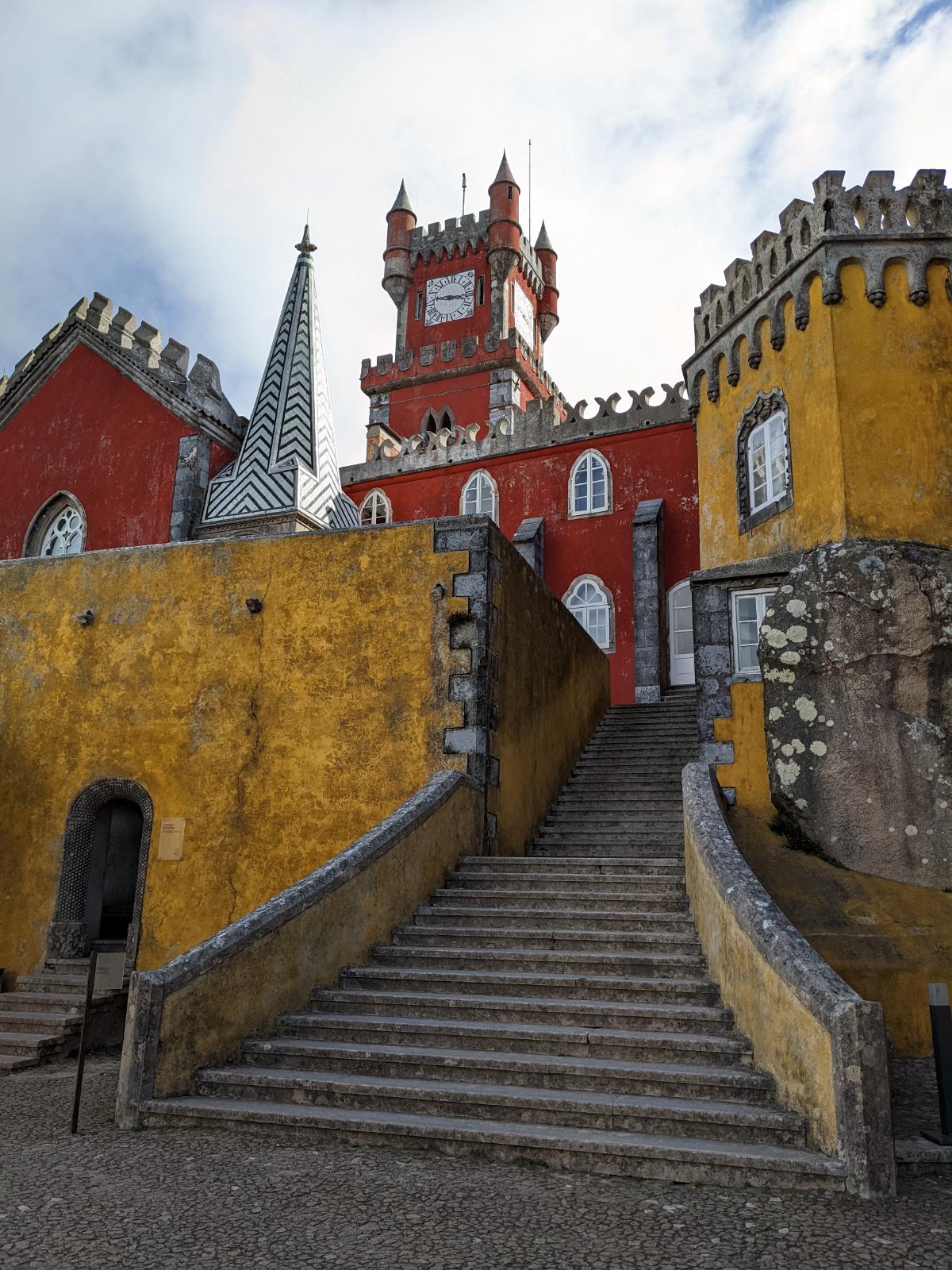
Without further ado, I’ll start out with showing you my finished sketchbook pages from Portugal! Some of these were painted on-site and others from photographs I took during the trip. I left spaces in the sketchbook for subjects that I knew I wanted to paint but didn’t have the energy or time to capture while traveling. Pena Palace is one of these places - the day was too busy to stop and spend an hour painting. You’ll notice that I played around with many styles on this trip, and I am modifying my style to allow me to capture places more quickly.
In the following section, I’ll show you some of the subjects of the paintings so that you can see how they transferred to the sketchbook.
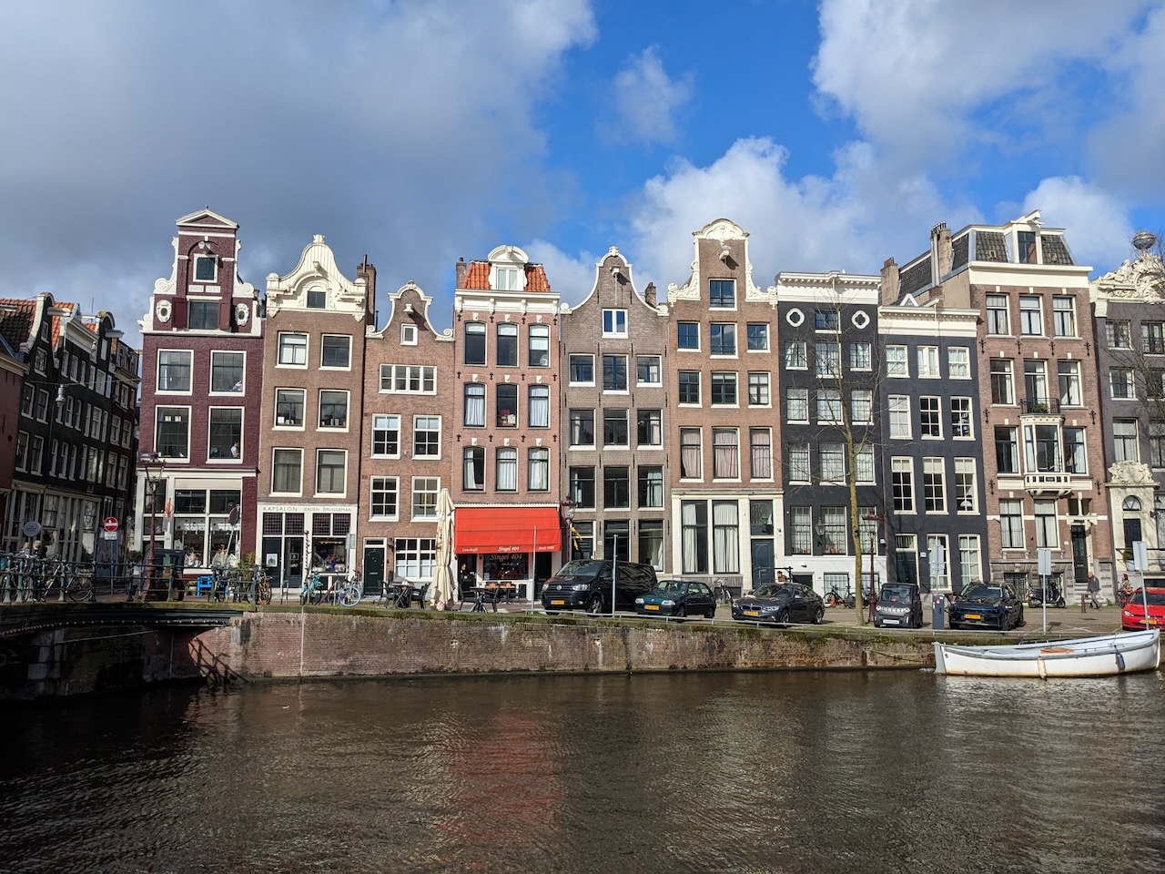
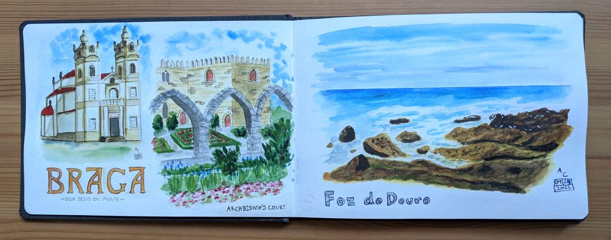
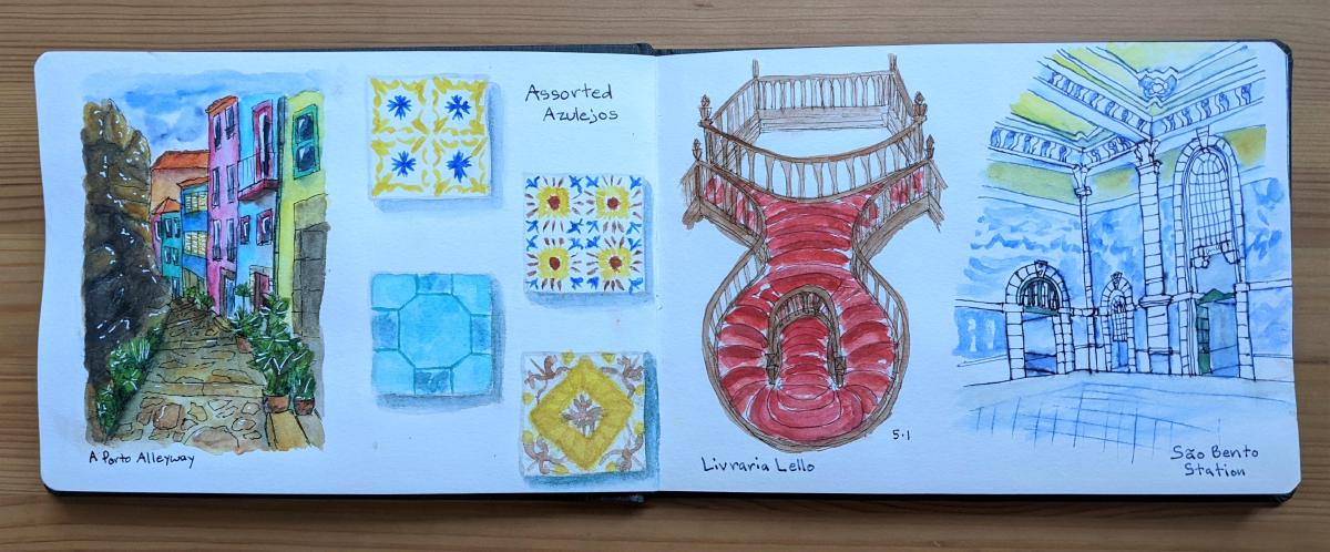
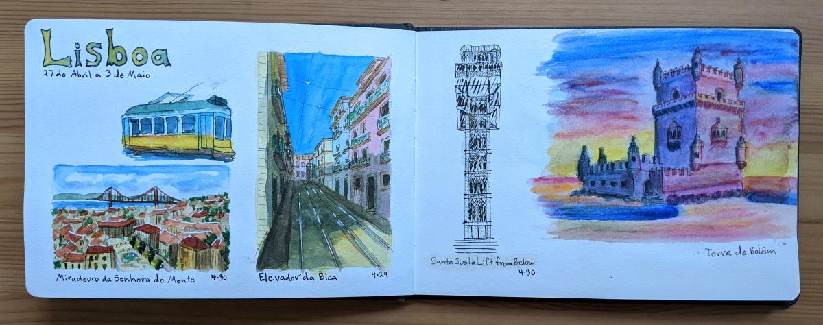
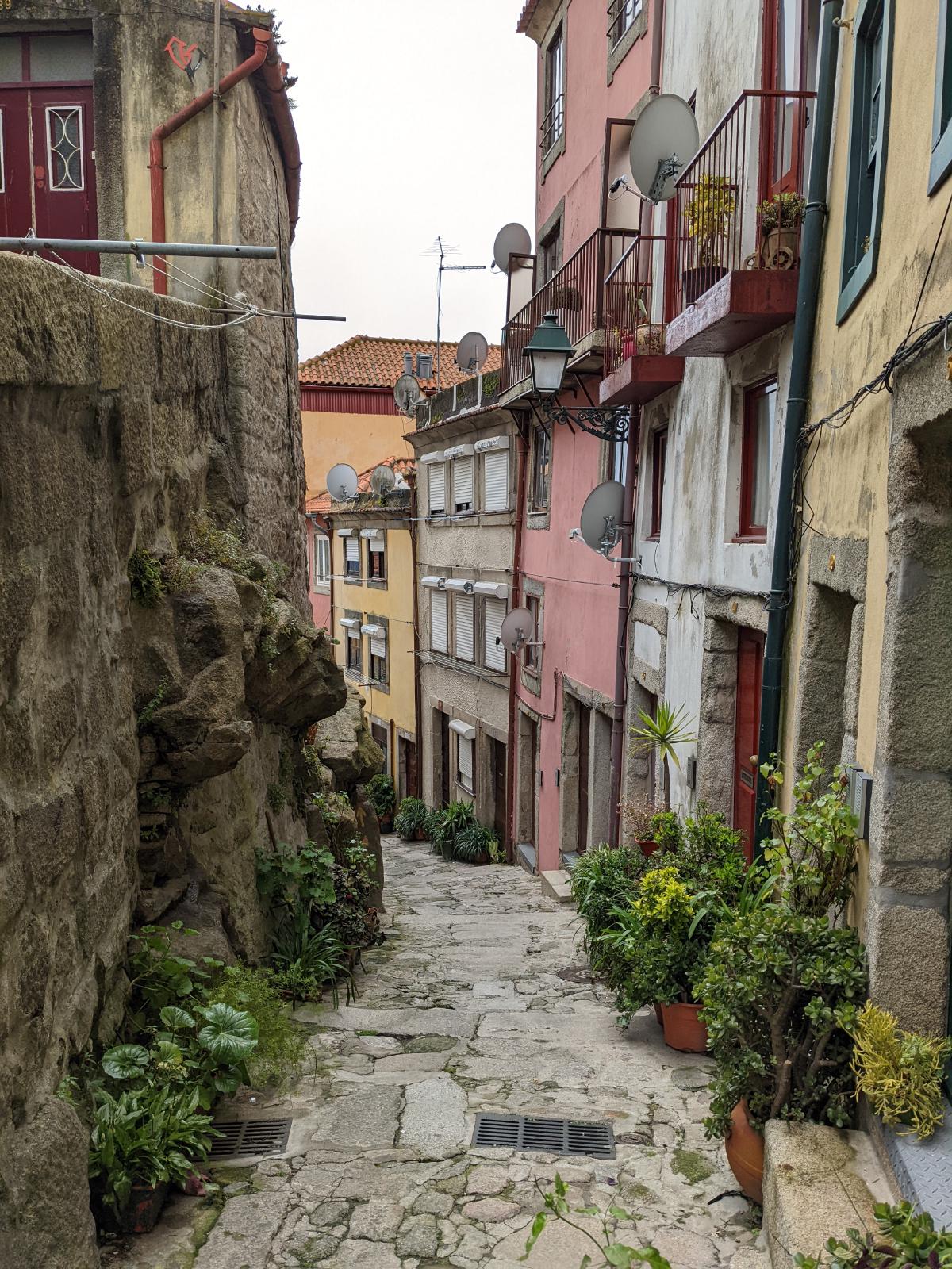
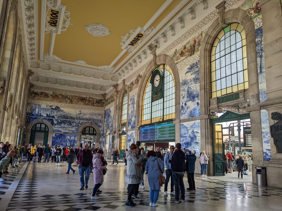
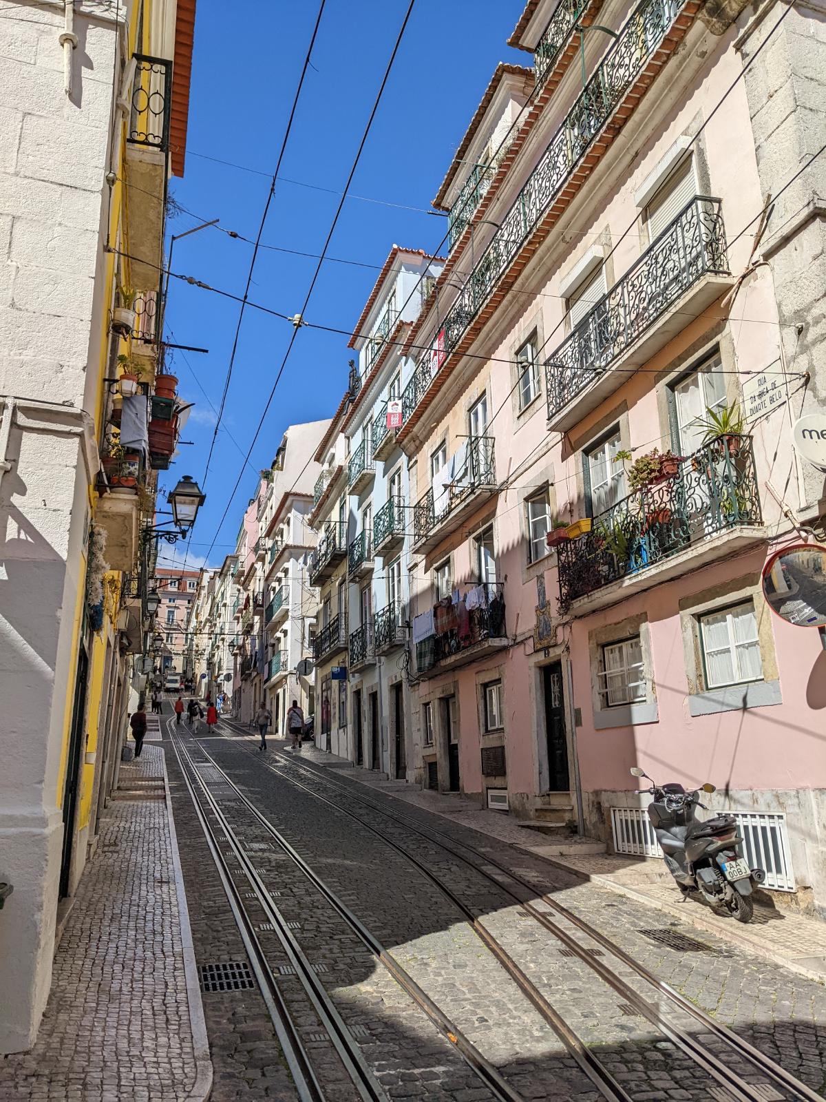
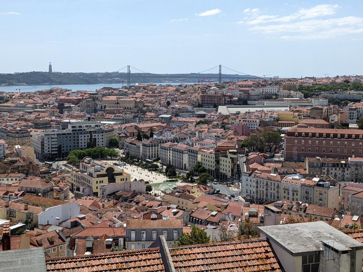
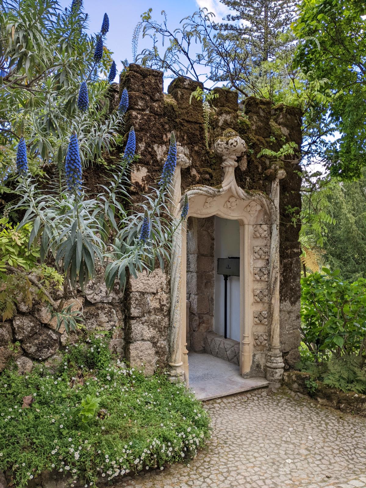
Food from Porto and the Douro River Bridge Day trips to Braga and Foz do Douro - thanks to Brenda Swenson for the inspiration for the Braga font! An alleyway in Porto, azulejo tiles, the staircase at Livraria Lello, and the São Bento Station Scenery in Lisbon, including the Santa Justa Lift, Tram 28, a rooftop vista, Torre de Belém (I took some artistic liberties here), and an elevador Pena Palace, an azulejo from the palace, and Quinta da Regaleira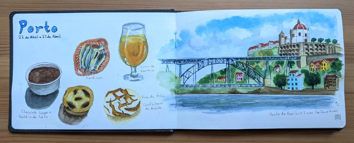
The Process of Painting
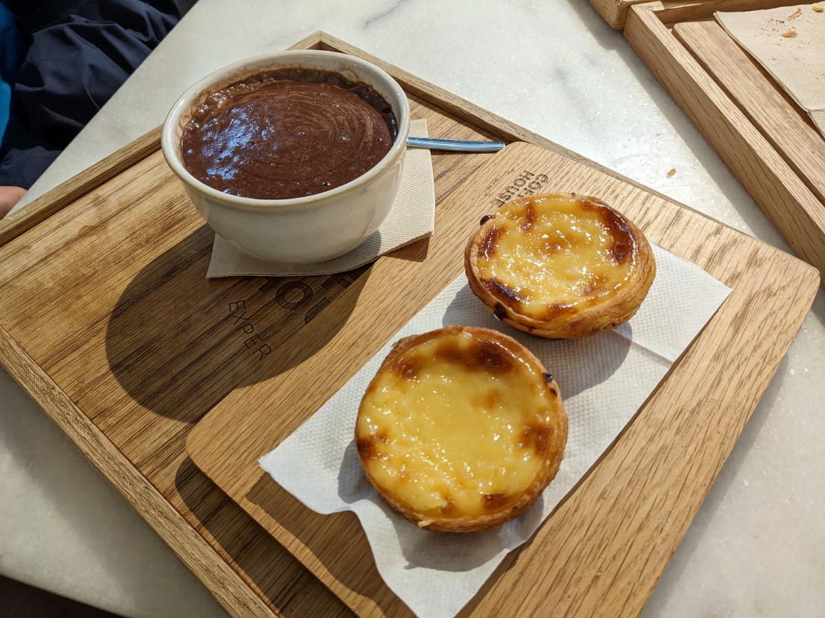
Porto and Lisbon were full of inspiring subjects to paint, but I was initially overwhelmed and didn’t know where to start. To break the ice in my sketchbook, I painted hot chocolate and Pastéis de Nata in a cafe on our first day in Portugal. This helped me get more comfortable with sketching in public. Other food items I painted from photographs when back at the hotel, but this one I painted on-site!
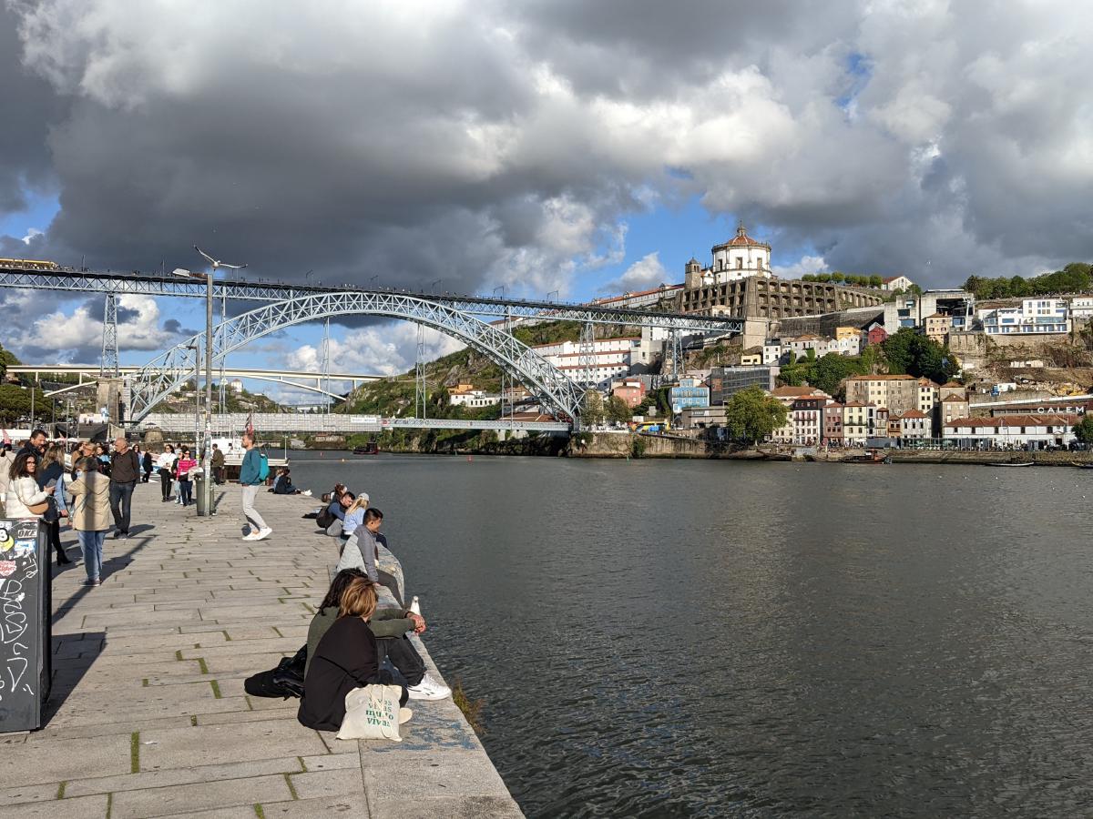
The following day, we spent an afternoon by the river while I captured the iconic bridge and monastery across the river from Porto’s old town.
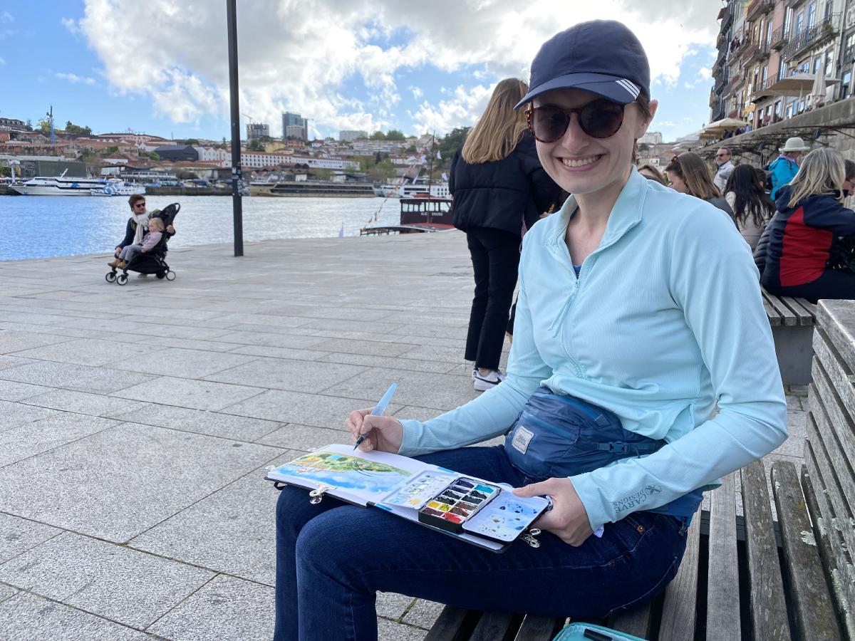
The actual view was beautiful, but I enjoyed using the sketchbook to capture it in a way that I wanted to remember. I removed all the people and zoomed in on the interesting elements. I started sketching from the water’s edge to get the proportions and perspective that I wanted, then I moved to a nearby bench to complete the painting and add the watercolors.
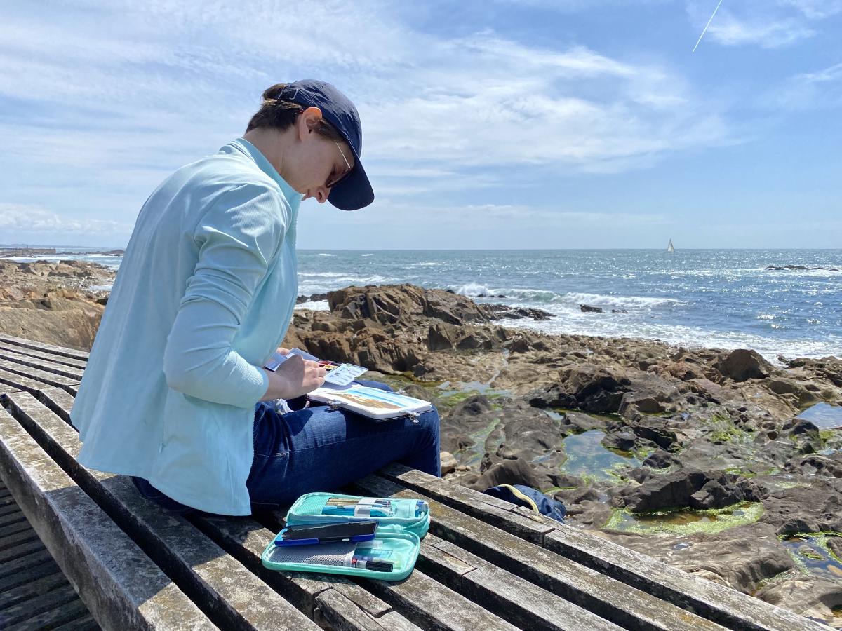
On our beach day, we walked down a boardwalk and settled in to paint the gorgeous rocks and turquoise blue water. Glenn patiently read a book on his Kindle while I painted.
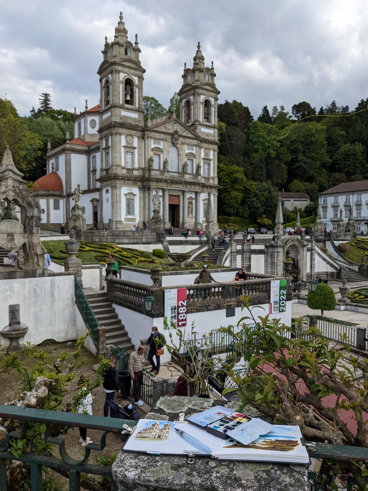
In Braga, the view I wanted to paint didn’t have good seating, so I set up on a concrete post and stood for about an hour while capturing the church. It was around this time when I realized I needed to find a faster method for sketching!
I took this picture on our first day in Portugal and knew that the view was begging to be painted, especially since the lighting wasn’t great in the photo. The beauty of a sketchbook is that I can capture the colors and the memory however I want.
I borrowed a friend’s fountain pen for the sketch of São Bento Station and enjoyed using the free-flowing lines and minimal pencil underlay. This was another breakthrough subject for me.
I painted this picture from my phone screen while sitting on a park bench eating a gelato.
Painting rooftop scenes can be overwhelming, so I opted for a small painting of this vista to capture the emotion without needing to worry about the details.
I’m glad that I decided to paint Pena Palace when back at home. It gave me the time needed to really explore the colors and shading for this vibrant building without sitting in the hot sun and dodging the crowds that showed up later that day.
I really focused on the contrast between light and dark when painting this scene from Quinta da Regaleira.
Finding My Style
This trip was my first deep dive into urban sketching, and I had a fantastic time! However, despite all my preparation, I also learned a lot about what I would do differently moving forward.
I played around with a few different styles of painting during the trip. I’d been practicing pieces with a full pencil sketch followed by very deliberate layers of watercolor and then some small pen marks or touches of white ink to finish up. While this makes for a beautiful piece, I didn’t feel that it captured the emotion of the place in my style. It also took a long time (though I know Alicia Aradilla paints this way and is much faster!) as I needed to do a pencil sketch followed again by full watercolor.
I tried some sketches that were a very quick pencil sketch to block out proportions, then outlined in ink and painted with more impressionistic watercolor (as seen in Archbishop’s Garden, Porto Alleyway, and Torre de Belém). This felt closer to my style, but the fineliner pens I was using didn’t allow for the expression I was desiring.
The real breakthroughs came with the Livraria Lello and São Bento Station sketches. These involved very free-flowing lines, with a fountain pen used for the latter, and essences of color to create a feeling without being too detailed. I enjoyed how the non-permanent blue-black fountain pen ink blended with the paints. This felt like the right combination of planning (a quick pencil sketch to block out proportions) followed by a freehand ink sketch (fun for me!) and then going wild with the watercolors (even more fun). The pencil sketch is my least favorite part, but I am glad that I understand how to do it so that I can now break the rules and go rogue. I’m able to capture scenes much more quickly and I can focus on the fun parts of the process. Because what’s the point of a hobby if it’s not fun?
Now, I’m working on developing my direct watercolor skills - painting entirely with watercolor and no pencil underlay at all. I know that I’ll use ink and pencil again, but deliberately practicing direct watercolor will improve my understanding of color and water, my spatial awareness and visual ability to break apart scenes, and my facility with the brush. I just got new brushes, too!
One of my first attempts at (almost) direct watercolor with a very rough pencil underlay. I love how this turned out!
I see urban sketching as a skill I can develop for the rest of my life. The beauty of this knowledge is that I know that I don’t need to have it all figured out now. The more I paint and sketch, the less any individual piece holds weight, and if I am not happy with one, then I use it as a learning experience and move to the next one. It’s an imperfect medium and a journey.
I’m so excited to have sketches of all my future travels to help me reminisce about special moments. I feel so much more present while sketching and I observe the world in a different way. Have you ever noticed how many shades of green there are in the trees? Take a look - you won’t regret it. Now I’m constantly thinking about how I would capture a scene or how I would mix a color to match something in the real world. What a wonderful way to appreciate everyday life!
Next up - I’m diving into Liz Steel’s Watercolor course now! She is a wizard with the use of color and letting the pigments mix and mingle to create “watercolor magic.” I’ll update you with my progress after the course!